 What size should your movie poster be? A seemingly simple question, but one that has a few answers. Not to worry, once you understand the end usage of your poster, the rest is a breeze!
I need a theatrical poster
The most common request we see: the theatrical one-sheet poster. This poster size is the one you will see in the actual theater as well as the 2:3 ratio of poster graphics you commonly see on websites like IMDb. The size for these posters is 27″ x 40″, and if you’re having one designed, don’t forget about the 0.125″ of “bleed” on each side. Bleed is the extra image area on the edges of movie posters that allow the poster to be trimmed to their actual size after printing without having any white edges. The poster should be at least 150 dpi if you’re having it printed, but if it is to be used online-only, the dpi doesn’t matter and you can simply focus on the pixel dimensions of your usage (usually at least 1500 pixels tall).
I need a theatrical poster… and I’m in the UK!
The British market has its very own standard poster size, and that is the quad poster. Measuring at 40″ x 30″ these posters are just 3″ larger than North American posters but with the big difference of being horizontal instead of the standard North American vertical. If you’re having a poster designed and considering a release in the UK as well, it’s best to have the poster designed 40″ x 30″ having a “safe zone” of a 2:3 ratio within it (the North American standard) where no important imagery or text will go beyond. Once the quad poster is designed, it can then be cropped down to the North American size with no worry.
I need an alternative movie poster or a poster for a promotional giveaway
Alternative movie posters and the ones you find rolled up at department stores are usually the easier-to-frame dimensions of 24″ x 36″. Since the end result is usually going to be a poster on someone’s wall at home, 24″ x 36″ frames are much easier to find as it is the common (non-movie) poster size, so these types of posters are usually sized in this way. Resizing down to these dimensions from a theatrical-sized poster isn’t very difficult either, as only a quarter of an inch needs to be trimmed from the poster’s height once it’s scaled-down.
I need a movie poster for (insert name of) VOD service
This is where things get a bit more complicated, but don’t worry, it’s manageable! The truth about VOD services is that there’s no ONE common size that all of them request. There are no standards across services, and even within a service, you will need different sizes. See for yourself a handful of dimensions required by Gracenote and TiVo below as an example:
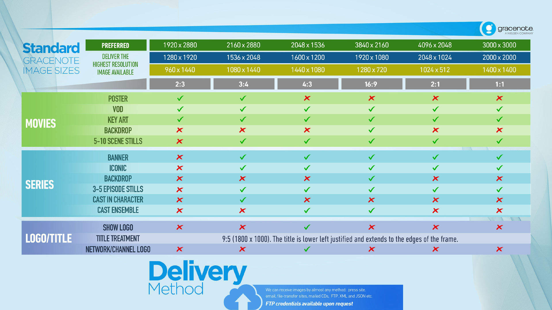
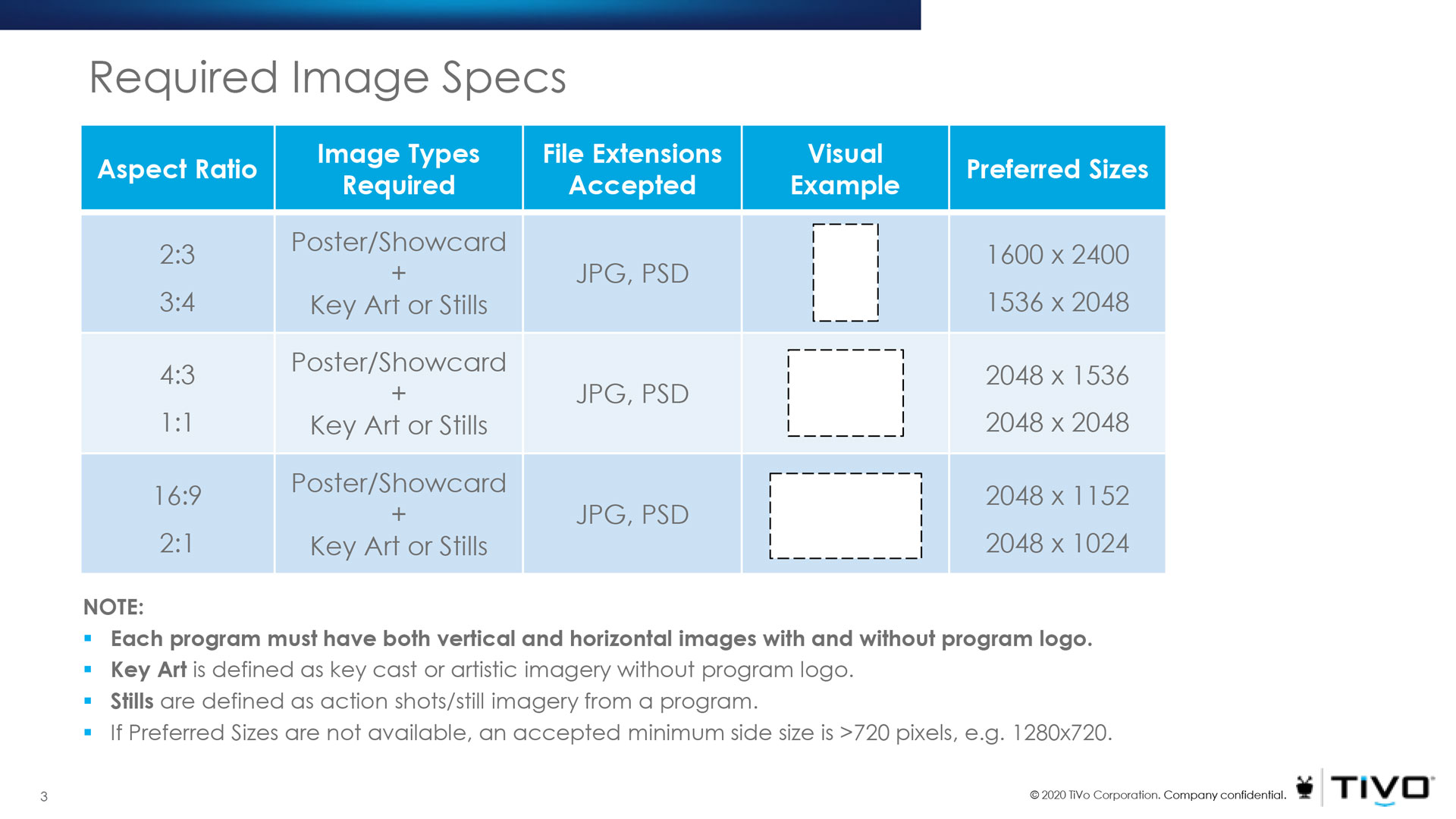
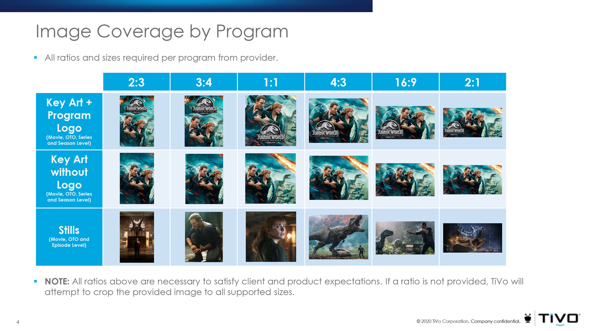
As we can see, there are a variety of sizes required, but luckily they can be broken down into a handful of main crops: horizontal rectangle, vertical rectangle, and square. Once the main artwork has been resized into these three aspect ratios, it’s only a matter of subtle tweaks to get them to the rest of the specific pixel dimensions, requiring shaving a few pixels from the top and bottom or sides.
When you have your key art designed, it’s a good idea to keep VOD in mind: make sure there’s extra image area outside of the crop of the theatrical poster, so you have that image data available if you need to widen an area or shift a character into the frame better. It’s also a good idea not to rely on imagery that is too vertical in your theatrical one sheet. If you imagine something like a tall narrow space shuttle in the centre of a vertical poster – it may be maximizing the vertical height of a movie poster, but cropping it to be a wide rectangle would be tricky, leaving a lot of blank space on the sides.
Hopefully, these tips will help you get your poster designed at the right dimensions for the end-use you need it for!

