
Check out Chargefield Creative Director John Godfrey’s latest article on the Association of Registered Graphic Designers website.
Growing up as a huge fan of movies and having an eye for design, I loved seeing movie posters. So much so that I wound up starting a movie poster design studio, Chargefield, where I make them every day! But outside of movie posters, my eye was always drawn to other intersections of film and design, from title designs in films, to fictitious computer interfaces that actors use on screen. But there’s another combination of design and film that’s present in our daily lives as much as the movie poster, and that’s the various film industry logos we encounter. From theatres to production companies, rentals to ratings, these are my personal favourite 5 Canadian film industry logos.
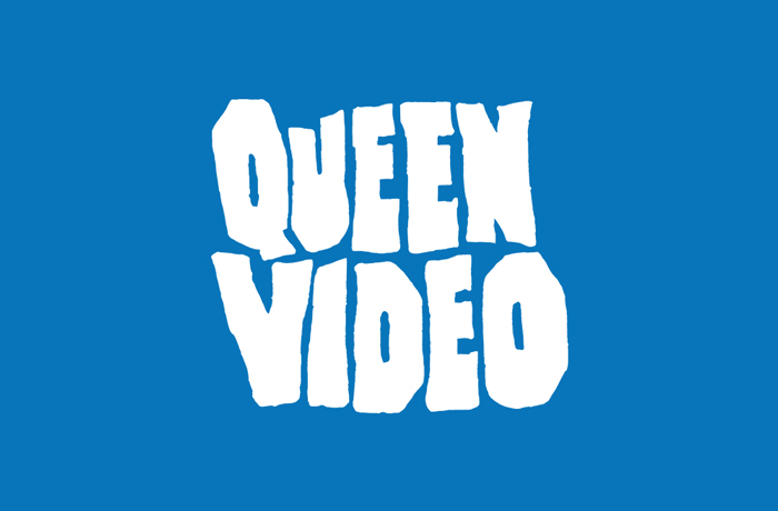
Queen Video
If you lived in downtown Toronto for a while, you’ve probably been past a Queen Video location while they were still in operation. One of the best video rental stores in the city, they had a wide selection of films that you weren’t going to find at Rogers or Blockbuster. The archives ran deep into a plethora of genres, eras and countries of origin, while the staff were true film fans that would help you find whatever you were after. The logo adorning the shops had a bold, rough, hand-drawn style that felt like the horror movie posters of the 1950s. The look was an affront to the polished, clean-cut and corporate chain competition, and acted as a beacon to film nerds indicating the diverse, cutting-edge fare available.
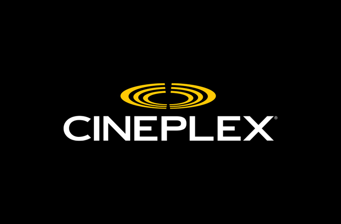
Cineplex
If you’ve seen a few movies in the theatre in Canada, you’ve most likely seen at least one of them at a Cineplex location. After all, Cineplex is the biggest theatre chain across the country, and while there are a few smaller chains like Landmark, Rainbow, and Imagine, they have a much smaller national footprint. As much as I love watching repertory and indie films in independent theatres, there’s something about the experience of the huge auditorium, big screen and overwhelming sound that brings back the spectacle and awe of movie night memories from my childhood. Cineplex’s logo hasn’t changed that much since I was a child in the 80s and 90s either – oval curves representing ancient Greek / Roman odeon seating (basically a smaller coliseum) were the main distinguishing feature – simple and effective. And, while I don’t think it was intentional, I always pictured the symmetrically split curves as film festival laurels which lent an air of prestige to the brand and the whole experience of a night at the movies.
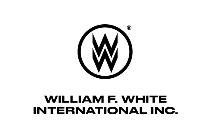
William F White International
If you live in one of Canada’s major cities or even smaller towns, you may have seen a movie being filmed on the streets. And if you haven’t actually seen something being filmed, you may have seen some of the evidence of a film shoot – trailers, lighting equipment, signs for background actor holding, lunch, or parking. Many of these items may have been accompanied by pylons with the text LES (location equipment services) and a WW logo on them. That WW stands for William F. Whites International, which is Canada’s only national motion picture equipment rental company, so it’s a ubiquitous sight on film sets across the country. The WW monogram logo is iconic, simple and bold, recognizable from a distance, and when seen, creates a buzz of excitement from knowing that the “next big thing” could be filming just around the corner.
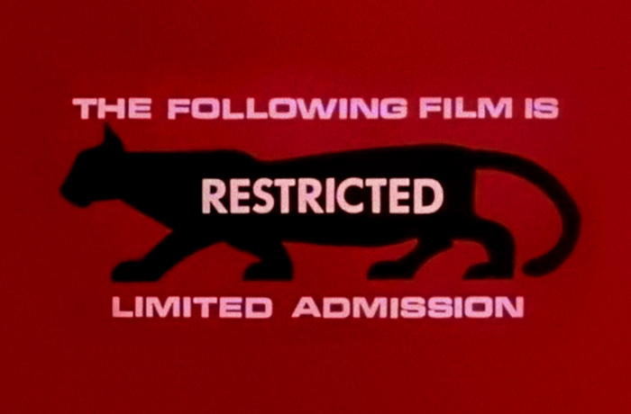
The Restricted Cougar
The RIAA’s “Parental Advisory: Explicit Lyrics” label on music is a motif designed as a warning but ended up serving as an advertisement for youth seeking out content that society deems inappropriate for them. The BC Film Classification Office’s Restricted Cougar functioned in a similar way for film in British Columbia. In the 1960s, BC’s Chief Censor sought to create a symbol that instantly let parents know that the content of the film advertised was not appropriate for children, while also integrating something BC-specific, the cougar, the province’s largest native wild cat. The resulting design was definitely eye-catching enough to alert parents as a content warning, but the black cougar silhouette on a red background also looked alluring and badass enough to attract underage audiences looking for something that they won’t find in a G-rated matinee.
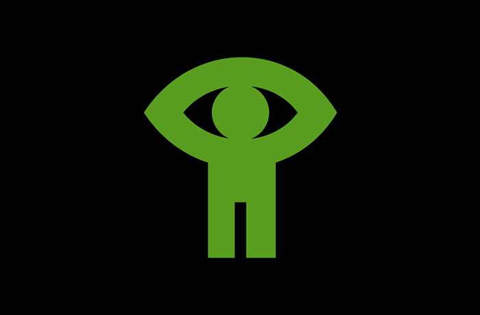
NFB
This is actually one of my favourite logos in general. The National Film Board of Canada is an agency of the Government of Canada and acts as our country’s public film producer and distributor. If you’re of a certain age and grew up in Canada, there’s plenty of content from the NFB living in your head rent-free like Log Driver’s Waltz, Hinterland Who’s Who and Heritage Minutes. But aside from those short TV segments, the board has been involved in over 13,000 productions including a dozen Academy Award-winning films and 74 Oscar noms. The logo was designed by Georges Beaupré in 1968, entitled “Man Seeing / L’homme qui voit” and it is the definition of clever, refined simplicity. The logo somehow manages to be fun, simple, and quirky, while also appearing bold, serious, and esoteric. Perfect for a film board where the content could be anything from a children’s cartoon to a serious documentary: the content you view shapes your perspective of the logo itself.