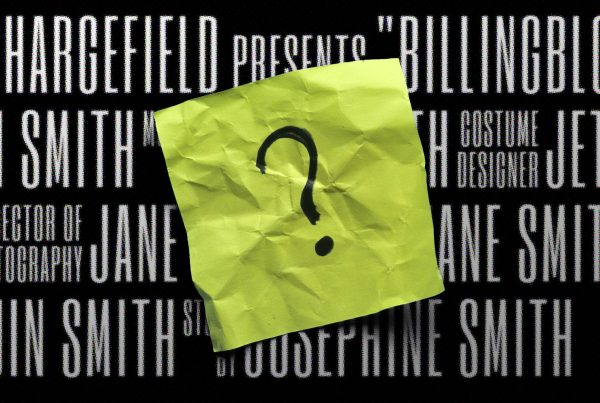
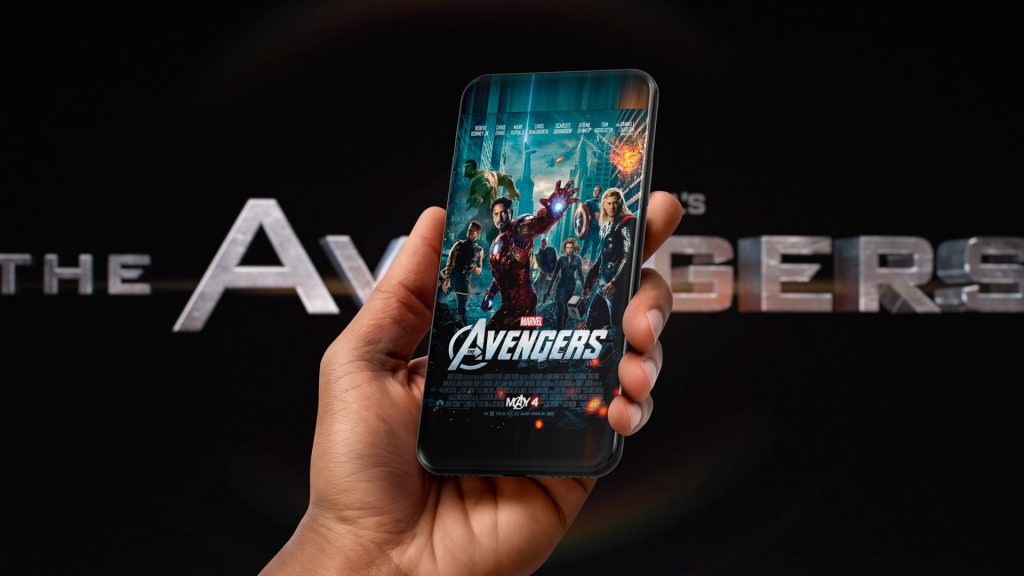
If you compare theatrical movie posters to the films they offer, a trend begins to surface fairly easily: the title design on the poster does not always match to what is playing on screen. Sometimes the gap is subtle. Sometimes it’s huge. The reason it tends to go unnoticed is that both versions are doing exactly what they should be.
A film’s title design does two things, and both tug on it in different directions.
Two designs for two jobs
A poster title lives in a competitive world. It has to work on a theater wall, a bus shelter, a streaming grid, a phone screen, and it has a fraction of a second to communicate the film’s genre, tone, and a reason to engage with it. As a result, the typography tends to be sharper, louder and more overt.
When the title sits on screen, the pressure dissolves. The movie’s audience will be already in their seats. The movie has gotten underway. The title no longer has to sell anything; it simply has to belong in the movie’s world.
Scream (1996) is an excellent example of the difference. The poster is made up of a modified Futura Extra Bold with the M sharpened to a downward spike. It’s clean, geometric, readable as horror from across the lobby. Inside the movie, the opening titles feature FF Confidential, a display typeface from FontFont designer Just van Rossum that reads like something printed on degraded thermal paper, or transmitted by fax. It has a corrupted digital character that fits the film’s tone, one where a phone call is an instrument of terror, where technology is where the threat lives. The poster puts you in the genre, and then the film puts you in the world.
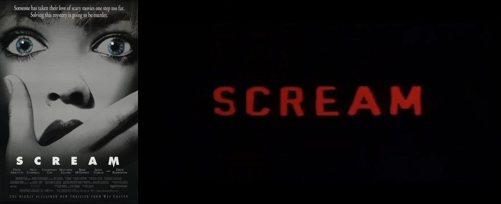
What makes Scream an interesting case is what happened to the series afterward. From Scream 2 the franchise nailed down the Futura-based logo and used it consistently on both poster and title card. The original mismatch was not a mistake, but was a first-film decision for a property that hadn’t yet turned into a series with a brand to protect. It wasn’t until there was a franchise that the math changed. That contrast of the immediacy of impact of the poster versus the incremental immersion of the film is central to why these designs diverge.
Selling loud vs. playing quiet
Poster titles thrive in noisy, competitive environments. All of this means the typography is more aggressive, bolder and more genre-explicit. A stark contrast to where the film’s title lives: a quietened theater with all attention focused on it. There’s no need to yell anymore.
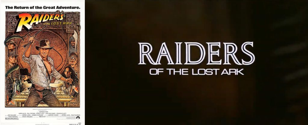
The difference in design between these two worlds is evident in Raiders of the Lost Ark. The poster features the iconic Raiders typography (to be adapted onto the Indiana Jones logo at a later date): chunky, shadowed pulp adventure lettering that art director Mike Salisbury created for the campaign specifically. It shouts action and adventure, to the promise of something propulsive. The film opens with a font that speaks to a different side of the same character: Open Kapitalen, a Roman-inscriptional typeface from 1929, paired with Eurostile for the subtitle. It has the feel of something carved into stone or stamped onto a crate, the kind of lettering you’d find on an artifact rather than a marquee. The poster is Indiana Jones the action hero. The title card is Indiana Jones the archaeologist.
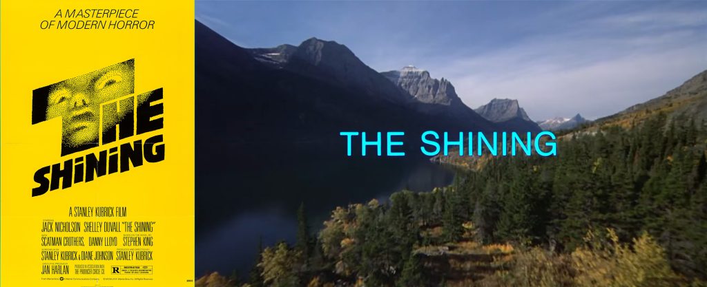
The Shining works similarly. The poster features custom lettering Saul Bass developed across over 300 drafts; bold, dramatic, expressive, designed to resonate with the eye. The movie kicks off with flat Helvetica. Clinical, neutral type set against the mountain helicopter shots gives them an unsettling feeling that dramatic letterforms couldn’t create. The poster draws attention through expressiveness. The film earns dread through its absence.
Designing for the film
Once you’re inside a film, typography becomes just one part of a mechanism with many moving parts. It has to mesh with the cinematography, the editing, the sound design. But more often than not, the right move is to just get out of the way.
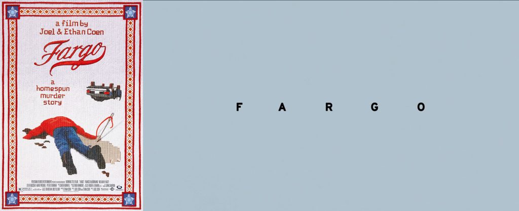
The Fargo poster, with its cross-stitch embroidery and hand-crafted, folksy style, instantly signals the Coens’ particular brand of dark comedy. None of that detail is present in the titling within the film. The credits play out over the widescreen frame in a plain, widely tracked sans serif, letters spaced apart like farmhouses on a highway. The typography is already performing the work of building the isolated landscape before a single character arrives on screen. The frozen emptiness, the great distances, the exact kind of desolation that make the story possible.
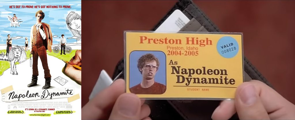
Napoleon Dynamite is a similar case. The poster uses handwritten lettering surrounded by Napoleon’s own drawings; charming, character-led, a deliberate design choice. Inside the film, the credits go one step further and become the props of Napoleon’s actual world: text on an ID card, Chapstick, as sauce on a plate. The poster says “kid with a big imagination that draws everything.” The film makes you live in his world.
Timing and process
There’s also a practical reason these designs diverge: they’re usually made at different times by different people.
Poster campaigns for large productions can start early, sometimes while the film is still being cut, sometimes before filming even begins. The main title sequence gets designed much later, once the film’s actual tone and rhythm are understood, often by a completely separate studio.
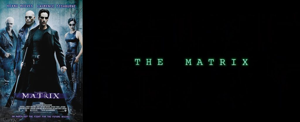
The Matrix is a good illustration of what that split produces. The poster’s title, composed of Times letterforms sliced apart and lined up again with digital interference, floating above columns of OCR-A rain, captures the film’s cyberpunk aesthetic as a composed, graphic object. It’s an identity. The film’s opening sequence views the same world from the inside: as something alive and generative, the title materializes from within cascading green characters built from a custom code-like typeface. Same sensibility, completely different expression; one frozen, one in motion.
The problem with static
The Thing (1982) is a good example of two designers independently reaching for the same solution and using it in completely different ways, which played to the strengths of their individual mediums.
Drew Struzan completed his poster for The Thing in under 24 hours, briefed on almost nothing about the film, he photographed himself in a parka for reference and had the painting collected the next morning. The resulting interaction with the typography is built around confrontation: the figure’s face radiating light outward, the title in tall, condensed Impact sitting at the bottom, bold enough to hold its ground against the visual chaos above it.
The film’s title sequence was made by optical effects supervisor Peter Kuran using a fish tank, smoke, and a stretched plastic garbage bag. He placed the title on an animation cel at the back of the tank with a light behind it, then set the plastic on fire. As it burned away, the light broke through the letterforms, the title appearing to ignite out of the dark. The light, like its usage on the poster, being the source of mystery once again.

Neither works quite as well in the other’s context. The poster’s bold condensed title, designed to hold attention on a theater wall, would take all the atmosphere of the film’s title away if you tried to burn it slowly into existence on screen. And the film’s slow, smoking reveal of the lettering, built around withholding, and the mystery of something about to be discovered, would simply disappear on all the visual distraction of the one-sheet. Same visual idea, completely different execution.
When the title becomes a brand
The clearest exceptions to everything above are franchise films, where the title design has graduated from typography into intellectual property.
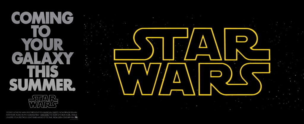
Star Wars is the obvious example, though even here the story is messier than it looks. The original 1977 one-sheet carried a vanishing-point logo designed by Dan Perri, a different design to what appears in the film. Suzy Rice’s Helvetica Black-based logo, which would become the franchise identity, had appeared on earlier teaser materials and was the design used in the opening crawl. So even at launch, there were parallel versions in circulation, and the marketing and film weren’t entirely in sync. From The Empire Strikes Back onwards, the franchise logo was locked and it went everywhere: posters, title cards, merchandise, toys, clothing, lunchboxes, cereal boxes, oranges, video games, theme park signage, novelizations, LEGO sets.
That’s the shift. The question is no longer what serves this film: it’s what survives every format, every decade, every product category. Consistency stops being a creative preference and starts being a business requirement.
When matching makes things worse
Outside of franchise territory, forcing the poster title into the film can actively damage the result.
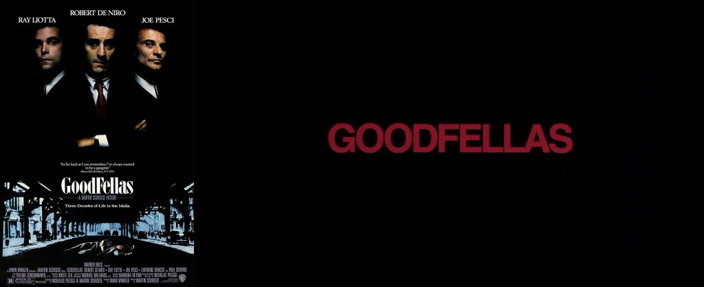
The Goodfellas poster carries bold, mob-era lettering that signals the genre from across the hall. The Saul Bass title sequence inside the film uses tight, stripped-down Helvetica Bold, animated as speeding cars against a driving score. Helvetica works precisely because it refuses to tell you how to feel; it just holds its own while the motion and sound do the heavy lifting. The poster’s letterforms in this usage would have felt excessive with the animation, not to mention less legible.
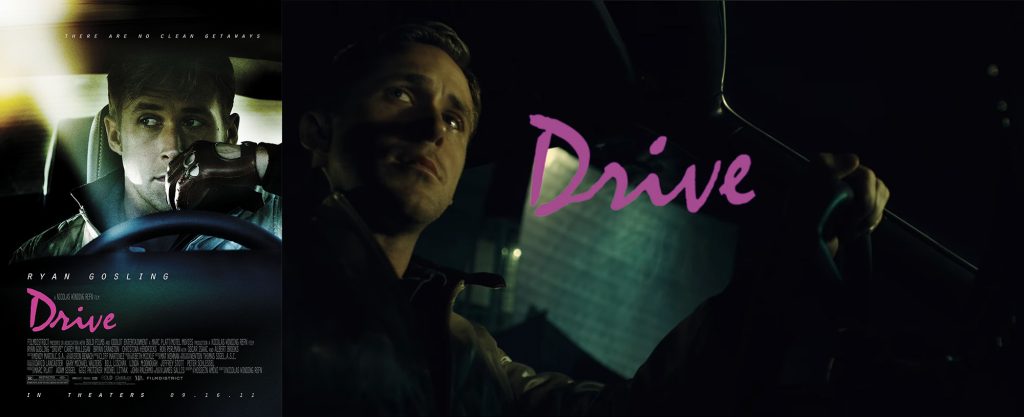
When a match does work, it tends to be because someone fought for it. Drive uses Mistral, a 1950s casual script in hot pink, on both the poster and the title sequence. That’s a deliberate artistic statement about the film’s relationship to genre and nostalgia, made to stick. Similarly, director Sean Baker has carried the same typeface across four films, specifically because he believes the poster and the title card should feel like the same object. “I always love when the title on the poster matches the title on the film,” he’s said. “Because it doesn’t often happen.”
The point
A mismatch between poster title and film title is usually evidence that both are working correctly and solving the right problem for the right moment.
They match when a title has become bigger than any single film: when it needs to live on a lunchbox as much as a screen. Everywhere else, the separation is the point. The job of the title changes the moment someone decides to watch, and good design changes with it.